Brecha
concrete, stainless steel, aluminum
2024


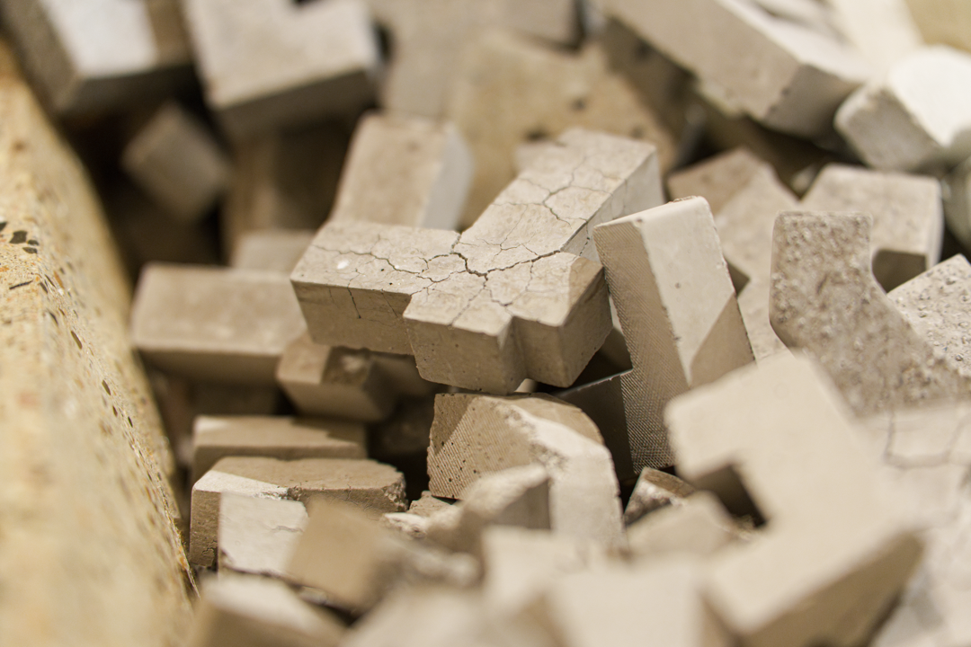
This work carries the double-edged title Brecha – a word that can mean both “escape” and “pool,” capturing a tension between departure and containment. It is here that the two typefaces featured throughout this exhibition converge.
One is a brutalist Hebrew font from the 1950s, historically associated with socialist aesthetics. Once common in Israeli public life, it now lingers only in fading government signage and mid-century communist posters. Its presence here evokes a sense of ideological relic – bold, rigid, and almost extinct.
In contrast stands Frank Ruehl, a more contemporary and versatile typeface. Still widely used today, it flows with a softer, more expressive character. It bends where the other stands firm, invites nuance where the other declares.
These two fonts – one brittle with memory, the other alive with possibility – meet within the framework of this artwork. Their dialogue is carved into repurposed domestic materials: plaster softens the hardness of the cupboard’s structure, allowing room for collapse, growth, or flight.